Design an Interactive Kiosk
Design an Interactive Kiosk
Stocklist is a shopping kiosk that could develop a service to help people sell their unwanted electronic possessions or buying cheap second-hand electronic devices by using this new type of interactive kiosk.
Stocklist is a shopping kiosk that could develop a service to help people sell their unwanted electronic possessions or buying cheap second-hand electronic devices by using this new type of interactive kiosk.
JUN, 12, 2019
JUN, 12, 2019
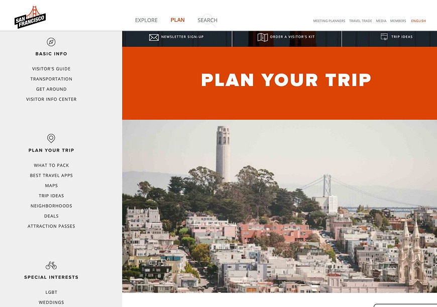
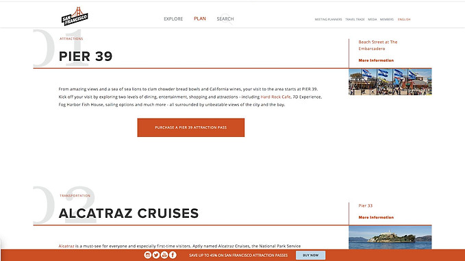
Usability Report for sftravel.com
The product is a website that offers travel service in San Francisco to assist first-time
and long-term visitors to explore the city after giving them information about activities,dining, hotel, transportation, trip itineraries and travel planner.
FEB, 21, 2020
Overview
The business goal of the product is to successfully attract tourists to San Francisco through varieties of day service and promotion services so that they could know more about San Francisco to promote the development of tourism services and the local cultural economy. The performance goals are to help them better tour, experience local life and culture by giving tourists comprehensive travel information and planning services. The competition for SF Travel could be other travel information and planner websites.
After doing the Competitive Analysis and Heuristic evaluation, I analyze the strength and weakness in general for SF Travel.
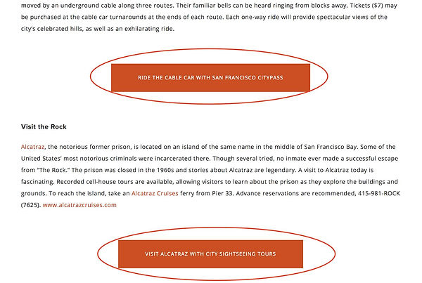
The website ensures that the information exploration is consistent. For example, in the article 28 things secret from the activity explore, the layout is logical since some striking buttons as links are set beside other related paragraphs. When people read the paragraphs and get interested in the activities, they could click the button for further information or book them directly. In terms of the interface design, it applies a big scale and the striking colors to encourage us to click it, which saves plenty of time for searching the information by opening a new window uninterruptedly and make the exploring progress more fluent.
Besides, the website does well in flexibility and efficiency. For example, it offers the searching options on the main menu and supplies people with opportunities to search for the attractions they would like to visit instead of browsing the whole website to single out a satisfactory tourist destination.

Eventually, it provides accelerator keys to speed up their trip planning progress. A pop-up window on the interface, which shows special offers during that date and is also designed. Therefore, the pop-up window is a good way to remind the users.
For the weakness, the website tries to include all the information about SF exploration but the whole website is lacking information collation and planning. It is very easy to bring people trouble when they are browsing the website, users could lack trust in the site and reduce their travel confidence.
The site provides a series of information a traveler needs and attempts to link with other popular booking sites to facilitate the next step. A large number of articles and pictures are adopted to show the attraction of destinations or activities, to give tourists more motivations to plan and order their trips. We should learn about its divergence and relevance. Use both of the traits to include all useful information and link the applicable information to the business entity to give the full play to the site's role as a third party propagandist.
For details: Competitive analysis and heuristic evaluation
Concerns
For the SF Travel website the non-aesthetic and non-minimalist design becomes one of the most concerned areas.
The website tries to include all the information about SF exploration and trip plans, leading to too much content in all the fields that need to be observed. Thus, the organization of all the information is essential. How to keep information organized and concise on one website page is the main problem they could work better. But for now,
the confusing layout and multiple directory display in the same page, not enough uniform color layout is used to make the site non-aesthetic and non-minimalist. There is too much information on the same page that gives people too many options. In this website, most dialogues contain information which is irrelevant and rarely needed. A lot of repetitive information doesn't need to be repeated on every site. It's possible to filter out the most useful information or to make the instructions or information clearer through concise typography. And there should be a certain order in the trip plan. Representing and categorizing the information in a specific aspect on the website can give tourists a better travel planning experience so that customers could have more sense of trust and reliance.
Research Questions
What are the pain points for users when they discover attractions and plan for traveling?
Knowing the pain points for travelers could help web designers understand their users better and have clear goals before designing the whole site. By this way, it could avoid problems like non-minimalist design, information overlapping and disorganization of information. Discovering what visitors really need and want to get rid of could make design more desirable for their target users.
How to connect the exploration with planner? How to create a system could add interesting trip ideas in their plan?
After attracting the tourists going to the destinations the web wanted them to go, the travel websites need to provide the planning service for users. The better connection between exploring and planning could make the site using process more fluent and efficient. It could save a lot of time for users to remember their favourite destination and search or add in their plan again. For example, maybe there could be a shopping bag on the site that users could shop for the attractions they want to go and the activities they want to join in. And the chart could help them plan the trip and schedule the timetable.
Are there aspects of the design that could be improved or streamlined to align with Minimalist design principles?
The minimalist design could help users to use the whole website more smoothly. And concise design can give users more explicit command so that users will not have a strong sense of confusion.
Original Hypotheses
I hypothesize that users have trouble in their exploration process.
I hypothesize that users think the UI design(big pictures, disminimal design, text size,ect) is distracting when they are navigating the website .
Users and Goals
The users are really broad and include first time visitors, long term locals and people who look forward to traveling. This site is designed for all the people who are interested in knowing more about SF Travel. Except for the people too young and too old that don’t have the ability to browse websites and plan trips by themselves, all the people could get useful information on SF Travel.
Participants
1. Age ranges: 14-64
2. Gender split: Male & Female
3. Language: English, German, Portuguese, Spanish, French, Italian, Japanese, Korean, simplified Chinese, traditional Chinese
4. Typical usage of relevant websites, such as other traveling websites,booking, KAYAK,ect.
Participants have passed the following questions:
1. Have you planned on a trip for 6 months ?
Acceptable answers: less than 6 months
2. Do you need any trip idea and trip planner?
Acceptable answers: Yes
The goal for the usability test is to discover the pain points when they use the website. And it not just discovered the problem of this website, it also could help web designers know more about their designing direction.
Tasks
List the key tasks you will test - phrase them as the user would. A range of around 3-5 tasks is sufficient, as participants will have only 15 minutes to complete the study.
Task 1: Start a case
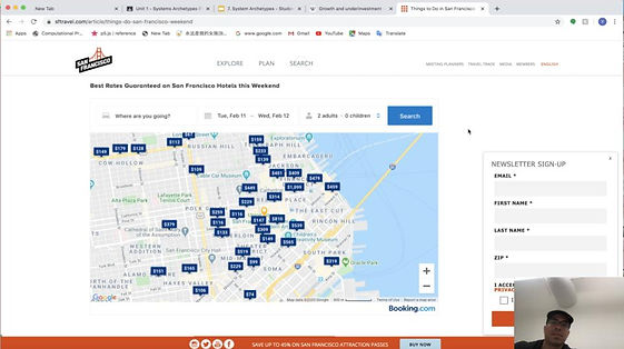
Scenario: You're in a room full of photos of the sights of San Francisco and you are planning for the first time traveling in San Francisco. Right now, you have a computer in front of you, this is what you see (participant sees home screen of the SF Travel website)
- How do you feel about the home page screen?
Task 2: Explore the attraction
Scenario: You've gone through the home page, and you've taken the next step of purposeful browsing and learning more about San Francisco(participant sees explore screen of the SF Travel website)
- Can you show me how you would explore the most interesting attraction?
Task 3: Plan for your trip
Scenario:Now that you know where you want to go, you want to take some action(participant sees plan screen of the SF Travel website)
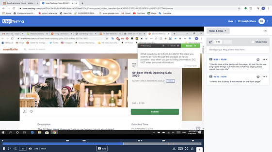
- What would you do to book tickets for the place you want to go?
Task 4: Find a bar
Scenario:Now that you want find some place for nightlife, you want to take some action(participant sees plan screen of the SF Travel website)
- How could you find a bar in SOMA?
Task 5: Wrap up
- What do you think we are lacking? How do you rate the whole service? Maybe
some suggestions?
- Is this an interesting service? Is this something that you would use?
- Is this something you would recommend? Why/Why not?
Success Measures
Succeed
Users are very satisfied with the whole service and move smoothly through our website to find the place they want to go, successfully booking everything that needs to be booked in advance. Users are interested in San Francisco through our website and confident about the journey.
Succeed with difficulty
Users feel good about the overall service. Users successfully find a place to go and place orders, but the whole process is full of doubts and difficulties. In the process of using it, I often need manual help and again consult. After the use of the completion of a better website and services, will not use the site again.
Failure
Users feel terrible about the whole website. Users have not been able to find the place they want to go through our website, nor have they been able to book tickets. In the use of the process encountered many difficulties could not continue and said that in the future, they will not use the site.
Methodology
-
Un-Moderator Test(User testing website)
-
Moderator Test
Results
Task success
The following graph shows the results of participants’ rating of task difficulty.
Surprisingly, all the users (in both moderated tests and unmoderated tests) succeed all 4 tasks. But their success levels are different for different tasks. Some participants succeed with difficulty, but some of them succeed easily. So that depending on different success levels I could find the most common trouble and pain points participants faced with when they navigating this website.
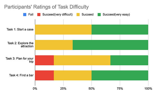
After analyzing the graph of Participants’ ratings of task difficulty, I find task 3 is the most difficult task and task 2 is the easiest task. In the task, 2 more than 65% of participants succeed the task easily. But in task 3, less than 30% of participants
succeed very easily, so that represents more than half of the participants have some trouble when they do any action for booking their trip. Also, task 4 only has 50% of participants who could finish easily. By this way, participants felt well when they just browsed the webpage without doing any action. But if they need to do anything on purpose they will face a lot of problems. For SF Travel, it’s business goals are not just to provide travel information, they want participants to use their web for providing them services to earn more and more money. After looking at and taking notes of their response, I find there is a problem most of the users faced with is about the searching part in navigation progress.
For more details:
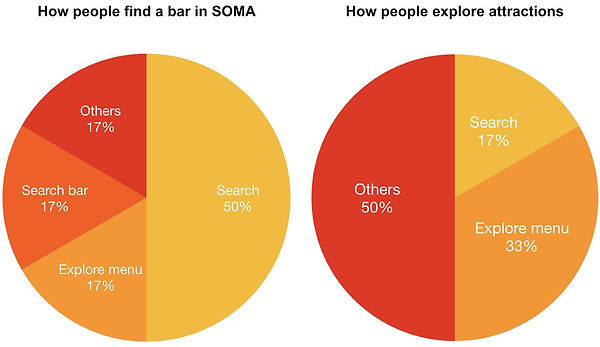
These two bars above are about the different ways of searching and navigating when they found a bar in SOMA and explored their favourite attractions. All the testers doing these two tasks have succeeded in the end. But most of them succeed with difficulties. These two bars could show what’s the most successful for searching and navigating when they finish task 2 and task 4. So that we could understand which method needs more effort for designing and which method is the easiest and most efficient way when users use the web.
From the bar of “How people find a bar in SOMA”, 50% of participants succeeded in task 4 by directly using the search button. From the bar of “How people explore attractions”, 50% of participants succeeded in task 2 by using other methods. Such as reading articles on the home page. And none of the testers successfully find their favourite attractions by using a search bar. This can also reflect the different choices and reactions made by testers in different situations and the advantages and disadvantages of different functions in different tasks can also be seen. When people had a clear destination, like a bar in SOMA, they could search the name of the place. But if they didn’t know where they were looking for and the search bar is hard to use they could only get the information from the front page. At this point, they couldn’t find the places they really want to go, so that they will give up using the website.
Causes of problems
Search bar
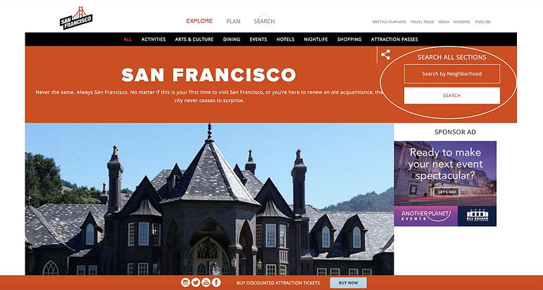
The site has many hidden but useful features. Very few testers found a useful category search feature in the corner during testing. The layout of the whole page results in the most useful and useful functions being buried, leading to the failure of users to find the right way to explore in time, thus spending a lot of unnecessary time. One of the tests reacted like " I'm not sure it to be honest. How do you find a bar and so much for nightlife for that?”. Then,"Oh search by neighborhood and see that. So if we go over to search by neighborhood and we went down… "
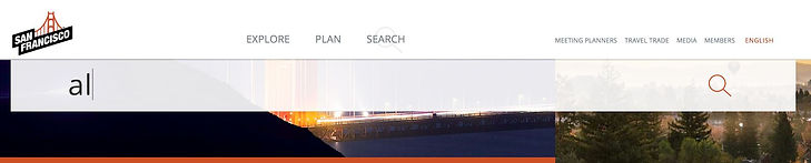
Search button
For the search button on the top of the website is a really essential part for the whole web using progress. But first-time travelers to San Francisco may not know the name of the place either, but they still want to search for information about the destination. At this point, we need to make the fuzzy search corresponding to the effect. For example, when searching for the first letter, there is an inscription function below to make it easier for users to find exactly where they want to go. But in fact, the search function for this location was not very useful in testing. There are no prompts and the search results are
very confusing.
Menu
There are two menus on the top with different sizes of front. And the explore button has a drop down menu that other buttons don’t have. The search button has an icon underther text that other buttons don’t have. And the language button is in different colors.The user interface design doesn’t keep a consistency that confuses users to make choices for which button they need to use. There are too many variables for the users to observe on the menu bar. So to keep themselves in a safe area, they always choose to ignore the risk menu bar which is really functional.

Others
When the users couldn't use the site to find the destination or attraction they wanted to visit, they tended to expect more pictures than lots of articles. Through the test, very few users read the article carefully. This affects the user's motivation to actually find where they want to go.
Recommendations
Search bar
The first thing I would recommend is that for the user experience design, they could change the layout of the page to make the search bar more obvious and more noticeable for users to find. For the original website, the search bar is on the top right corner with a low hierarchy. And when users test the site they find the search bar needs at least 2 times for browsing the whole page. Some participant suggested that "So maybe make that more noticeable if you want to search by neighborhood." I think the position of the search bar is not noticeable enough for users to find it, even the search bar has an effective drop-down menu for clear categories and neighborhood searching options.
Search button
The second thing is to make the search button much easier to use. They could add some function that could allow fuzzy search or people could just tab the initial, then it is going to show all the likely results for their need. That could help the first time visitors who didn’t know the spelling of the destination names.
Menu
Also, I want to recommend that building a better, clickable and clear menu could help the whole process of using the web. In Sf Travel, when people browse the home page, they could see the exploring menu on the top, but less portion of users use the menu to help them explore the things they want. I think the reason is that the menu is not desirable enough for users to click it. And they need to put more effort into the user interface design of the menu section of the website. A good menu could help the whole website navigation better.
It is really worth thinking of why they need two levels hierarchy of exploring buttons, one is the search button on the menu, another one is the search bar. Both of them have the same meaning and the same vocabulary. Also, the user interface elements between the exploring button on the menu and the search bar are the same. Both of them have a drop-down menu. How to distinguish these two sections is a good problem I recommend to solve. Maybe by different vocabulary, different User interface elements, different layouts, etc.
Consistency of the Webpages
They could do more in keeping consistency when doing the two tasks. So users could follow the same methods when they look forward to finding travel information. The different number of people finish the two tasks by using different methods to reflect the situation that they could not use the same method for searching and exploring traveling information. Participants reacted like “I would hope that staying on the same site” “ It makes me feel like a third party pop out”. In this way, it could cause a lot of inconveniences using the site. If the website could keep a kind of consistency in the searching function, the users could have memories of using this website. For example, they could use the same search bar, same layout, color, position, typography, etc.
Minimalist design
When some of the participants did the first task they gave me responses like "I like to look at the design of the page. It's just that I try to segregate things out more like what this page is just about the nightlife.” "I would just try to get this kind of it just feels mixed in with everything else. I would try to segregate out the hotel book and you know certainly make it something that you are as focused as you want to be.” The minimalist design could give users a good impression of the whole website. And simplify the information and option on each page could encourage users to keep using the website
by feeling rewarded from finishing each page.